piatok 30. októbra 2015

Gastro+ /2015

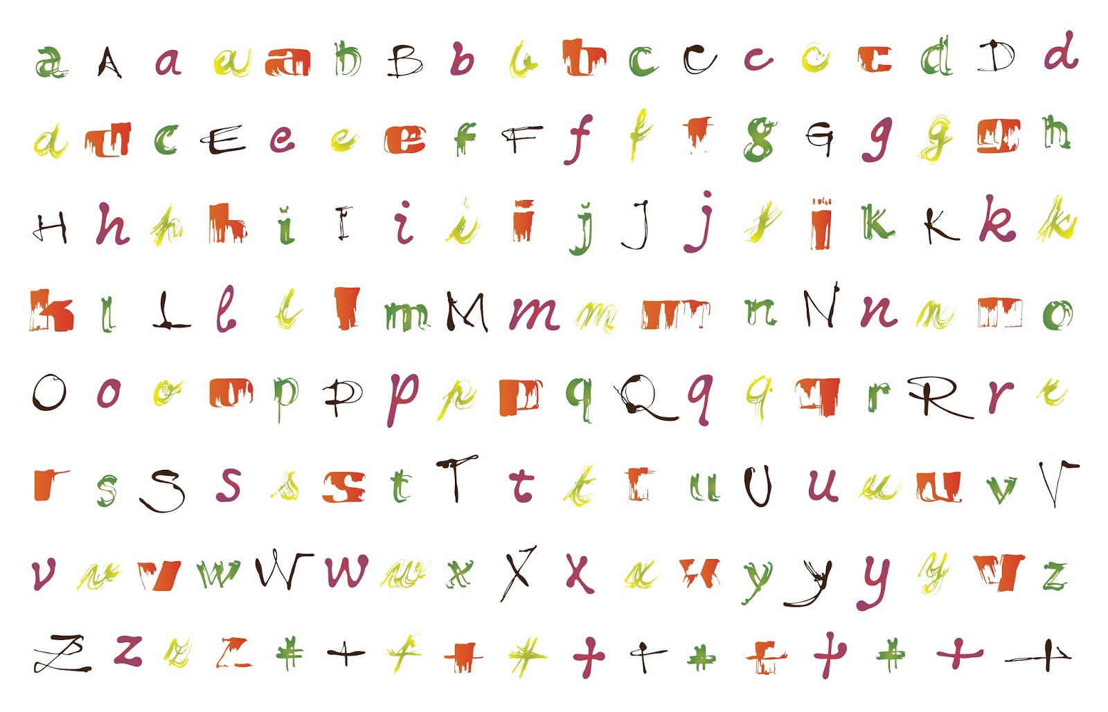
Gastro+ is typeface created for company doing catering services. Process of creating the typeface is very important. I was working with real pieces of food and each style of typeface is created on another way. And all styles are hand making in first phase, than I digitalized it and make like real font. 

http://gastroplustn.sk/


eurokontext.sk /2014, 2015, 2016

http://www.eurokontext.sk/sk/

This work was a cooperation with Marcel Benčík (coordinator of the 1st year), Lenka Navrátilová (coordinator of 2nd year) and Anna Ulahelová. We made visual identity for exclusive international theatre festival in Bratislava.


Bratislava designweekend /2012


Hmlu zrak nerozptýli /2014


city honey /2014

Sketch of a visual language for a new company which produces special honey from bees in city and other home-made products. My idea is inspired by real shapes of pollen from flowers.


65 years /2014

Anniversary Academy of Fine Arts and Design. I made the stamp for every year, from 01 to 65. Each and every one of these stamps is made with a special font. Therefore, there is 65 stamps, 65 fonts. Just slovak and czech typographers.


Adam /2014

Visual identity for the artist. A signature is a very dominant thing for every artist. Consequently, my idea is that logo is a signature and reverse. Special font, visit cards, catalogue of works are obviously made cooperation, consulting Adam Šakový.