The object of project is to create new, readible and simpler map of Trenčín to make beter communication between urbanists and citizens.
Very important part of the work was definition of problem. It's the problem of communication between urbanists of city and people whoes need to read this urban map and it's really hard readible for them. It is necessary to tell that actual official urbanised plan begun to be relevancy at the end of the year 2012 and is necesary to tell that urbanists which was working on this plan are opened for this idea. In the first part project is analyzing actual official urbanised plan, which is accesible for any people in web page of Trenčín. Important are that informations, which can show problematics of urbanism to people which are not educated in this part of architecture. In this part of work was more that important to cooperate with specialist. In this case was Ing. Arch. Adriana Mlynčeková the best choise, because of she is workning in Trenčín as an urbanist now and she also was working as an main urbanist. Second part was about finding best functionality and the formal part of map. The map is working with intuition and scale of city. Plan is composed from 5 maps. Each of that map is in other scale, form 1:5000 to 1:100 000 and each of those maps show us another way how to look on Trenčín. The map is getting us wiew how to look on problematicks of urbanism. The last part is formal problem. The map is drawing very strict, it means we can see only straight lines in 0n 45 or 90° angle. This can seems drastic but during process of drawing it seems to be good choice. Is easy to work with this type of mapping. It is sometimes hard to read informations like this from geographical map, so because of that this type of drawing is more than right choise at the expense of some small problems.
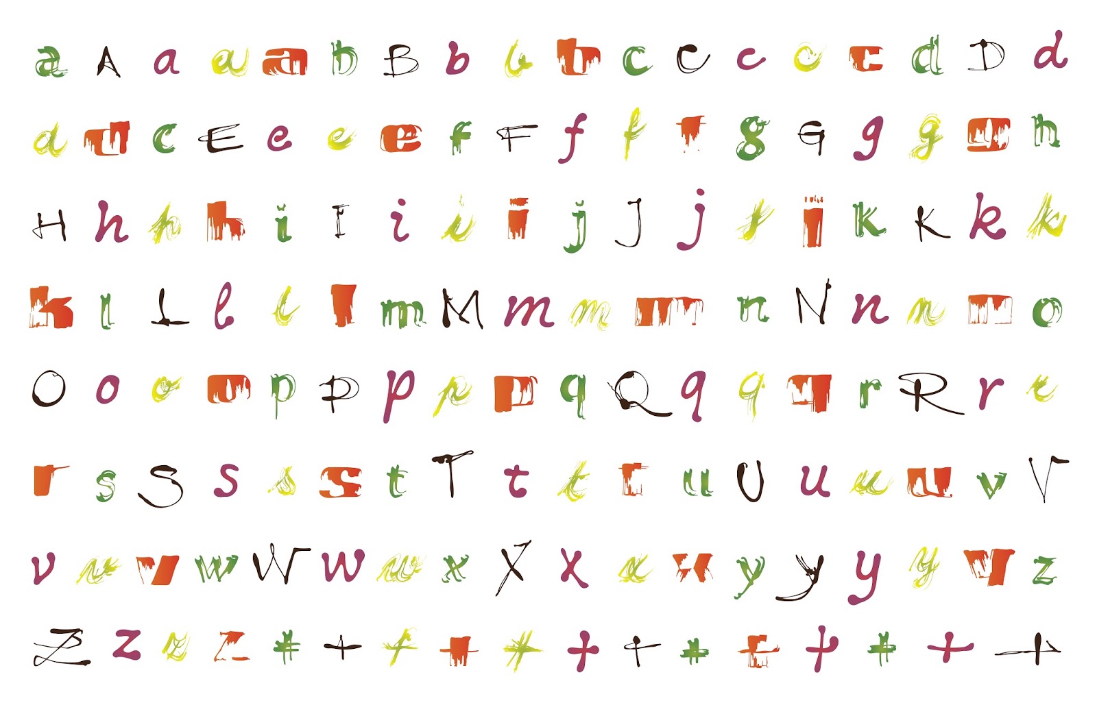
Gastro+ is typeface created for company doing catering services. Process of creating the typeface is very important. I was working with real pieces of food and each style of typeface is created on another way. And all styles are hand making in first phase, than I digitalized it and make like real font. http://gastroplustn.sk/
This work was a cooperation with Marcel Benčík (coordinator of the 1st year), Lenka Navrátilová (coordinator of 2nd year) and Anna Ulahelová. We made visual identity for exclusive international theatre festival in Bratislava.


